Start with the wall and the space around it
Before we recommend a material, we look at the wall itself. Painted drywall, plaster, brick, glass, timber cladding and tiled feature walls all need different fixing methods and different sign styles. A clean acrylic panel can look sharp on a smooth wall, while a mounted aluminium or PVC board often suits a busier surface better.
In Boksburg and across Ekurhuleni, many receptions have aircon, direct sunlight at certain hours or heavy foot traffic from deliveries and clients. That affects glare, dust build-up and where the sign should sit. If the sign is too close to a doorway, it can be missed. Too high and it becomes hard to read. The sweet spot is usually at eye level from the main waiting area, but we still check each site on its own merits.
- Check the wall finish first
- Measure the available width and height
- Note any lights, switches, fire equipment or glass nearby
- Confirm whether drilling is allowed on the premises
Match the sign style to your corporate look
A reception sign should fit the business, not fight it. A professional firm may want a neat dimensional sign with raised letters. A clinic might prefer calm colours and clean sans serif lettering. A contractor often needs something more direct and durable, especially where the reception sits near a workshop or loading area.
We regularly make reception signs for offices, showrooms, medical rooms, industrial offices and body corporate spaces. The choice may be cut vinyl on a panel, printed graphics, brushed effect lettering, or layered boards for a stronger finish. If you already have brand colours, we match them as closely as possible and keep the layout tidy. No clutter, no tiny text that nobody can read from the waiting chairs.
- Keep wording short and readable
- Use your main logo first, then the company name if space allows
- Avoid too many colours on one wall
- Choose a finish that suits your furniture, flooring and lighting
Decide how far away the sign must read
Viewing distance matters more than most people expect. A sign seen from 2 to 3 metres in a small reception can carry more detail than one viewed from across a double-volume foyer. If people will read it while standing at a counter, the lettering can be smaller. If it needs to be seen from the entrance, the format must be bolder.
As a simple guide, larger letters work best for open spaces and long sight lines, while smaller signs suit compact lobbies with close seating. We also look at contrast. Dark lettering on a light background is easy to read. Light on light often disappears in daylight, especially near windows. In coastal humidity or dusty industrial areas, we also consider how the finish will hold up over time and whether it will need occasional cleaning.
- Short distance: compact panel, clearer detail, neat finish
- Medium distance: stronger contrast, larger logo, fewer words
- Long distance: bold letters, simple layout, fewer design elements
Choose the right material and finish for daily use
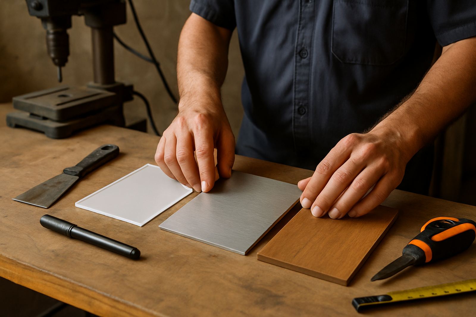
Reception signs are handled by people, cleaned by staff and exposed to office wear and tear. That is why material choice matters. Acrylic gives a neat office finish and works well for layered lettering. Aluminium composite board is a practical option where you want a firm panel that stays flat. Cut vinyl is useful when the wall itself is smooth and the design is simple. For a stronger visual effect, we can build up the sign with raised elements or a combination of board and lettering.
If your office runs on backup power during load shedding, the sign still needs to look good in daylight and under emergency lighting. Glossy finishes can reflect too much light, while matt or satin options are often easier on the eye. In humid areas or where cleaning is frequent, the fixing method and edge sealing matter just as much as the face material.
- Acrylic for a crisp office look
- Aluminium composite for a solid panel
- Vinyl graphics for simple walls and cost control
- Layered signs for depth and stronger visibility
Plan the content before anything is made
A reception sign should answer the visitor quickly. Most signs do best with the company name, logo and maybe a short department or welcome line. If you add too many details, the message gets lost. Long taglines, multiple phone numbers and small legal text are better suited to a separate notice board.
We usually help clients prepare the artwork so the spacing, wording and proportions work on the wall size you have. If the branding already exists, we follow it carefully. If not, we keep the layout simple and practical. A sign that looks neat from 5 metres but confusing at 1 metre is not doing its job. A good reception sign must be clear to visitors, clients and delivery drivers alike.
- Keep the message short
- Check spelling, spacing and punctuation before manufacture
- Decide whether a logo, name, or department line must lead
- Allow room for mounting hardware or wall fixes
Installation, maintenance and the mistakes to avoid
Even a well made reception sign can disappoint if it is mounted badly. We check level, alignment and fixing points so the sign sits straight and secure. On some walls, the fixings need to be adjusted to avoid cracking, uneven gaps or visible damage. In commercial buildings, we also work around access times and safety rules so the area stays clear for staff and visitors.
Common mistakes include choosing a sign that is too small, using colours with low contrast, or hanging it where it is blocked by a plant, a chair or a security gate. Another issue is cleaning with harsh chemicals that dull the face or damage the print. A proper maintenance visit can keep the sign looking sharp for years, and if a reception changes tenant or branding, we can remove the old vinyl or panel without leaving the wall in a mess.
- Inspect the wall before drilling or bonding
- Keep the sign away from obstructions
- Use gentle cleaning methods
- Plan for future rebranding or refurbishment