
A repeat campaign that needed fast turnarounds
The client was a property team operating in Alberton and nearby streets, handling several suburban listings over the same period. Their brief was straightforward: make sale boards that were easy to read from passing traffic, and add directional arrows for open days and home viewings. The boards had to look consistent across multiple properties, because the team wanted one visual standard for the entire campaign, not a fresh layout every week.
They also needed a supplier who could keep pace with quick changes. One week a board might go up on a corner stand, the next week it would need a different arrow direction or a revised telephone contact. That meant we had to build the artwork in a way that allowed fast swapping of details without redoing the whole job. The site itself was typical Alberton suburbia, with a mix of boundary walls, narrow verges and occasional municipal restrictions on where a board could be placed. Not every stand offers the same visibility, so the board size and mounting method had to work in real conditions, not only on paper.
- Client type: property marketing team
- Area: Alberton and surrounding residential streets
- Use: repeated sale campaigns and directional wayfinding
- Main need: consistent boards that could be reproduced quickly
Board sizes, materials and visibility
We supplied printed estate boards in a practical format that could be seen from the road without overpowering the property frontage. The main panels were made in 3 mm fluted PVC board, chosen because it is light enough for easy handling and stiff enough for short to medium term outdoor use. In the summer heat and late afternoon glare common across the East Rand, that matters. The print was set up for clean reading at a distance, with high contrast text and clear arrow placement.
The standard board size used on this project was 1 200 mm by 900 mm, with some arrow panels trimmed smaller for tight corners and pedestrian routes. We also produced a few smaller rider panels for urgent changes, which saved the client from replacing full boards when only one detail changed. All graphics were prepared for outdoor exposure, with cut vinyl elements where needed and printed elements where speed and consistency were the priority. The edges were finished neatly so the boards would look straight when mounted on poles or fixed to walls.
- Material: 3 mm fluted PVC board
- Main size: 1 200 mm x 900 mm
- Smaller arrow panels for narrow access points
- Outdoor-ready print for sun and weather exposure
Artwork setup for repeated listings
Because the campaign was not a once-off, we set the artwork up as a reusable system. The property team could give us a new address, arrow direction or agent contact, and we would update the relevant panel without disturbing the base layout. That made the whole process quicker and kept the campaign looking consistent across different streets in Alberton.
We kept the wording short and direct, since estate boards need to be read in a few seconds by drivers and pedestrians. The typography was sized for legibility at street level, and the arrow graphics were kept bold enough to be visible even when the board sat slightly back from the road. We also checked that the wording would still read well in bright midday sun, since reflective surfaces and busy roadside backgrounds can make weak signage disappear. This kind of prep work cuts down on mistakes later, and it helps the client move faster when a listing goes live. There was no need for fancy styling, just clean alignment and a layout that did its job.
- Reusable layout for multiple properties
- Short wording for fast roadside reading
- Arrow direction adapted per address
- Artwork adjusted without redoing the whole board
Production, mounting and a two week roll-out
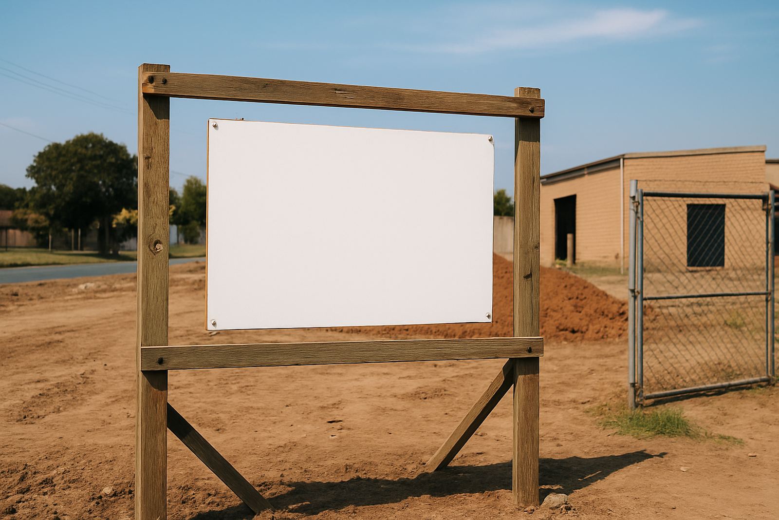
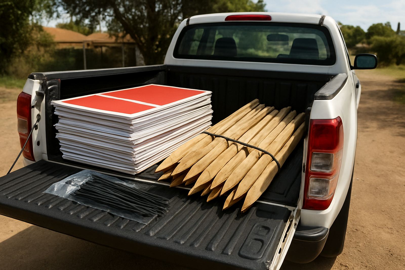
Production took place over two weeks from sign-off to first installation. In week one we finalised artwork, cut the panels and completed print and finishing. In week two we handled fitment, making sure each board was mounted properly for the location it was going to serve. Some boards went onto boundary walls, while others were placed on temporary stands for campaign use. We also supplied fixings suited to the surface at each property, which is important because a good board can still fail if the wrong mount is used.
For the directional arrows, we kept the fixing method simple and practical so the client could re-use them when needed. The site crew worked carefully around driveways, gates and paving, and where a property had a tighter frontage we adjusted the placement to preserve sightlines. There were a few small changes as the team got feedback from the field, nothing major, just the sort of thing that happens when a campaign is moving quickly. By the end of the second week the set was up and in circulation, with the boards ready for repeated use across several homes. The client needed few call backs after that, which is what you want on a job like this.
- Timeline: 2 weeks total
- Week 1: artwork finalisation, print and finishing
- Week 2: delivery and mounting
- Fixings matched to wall, stand or pole conditions
What changed once the boards went live
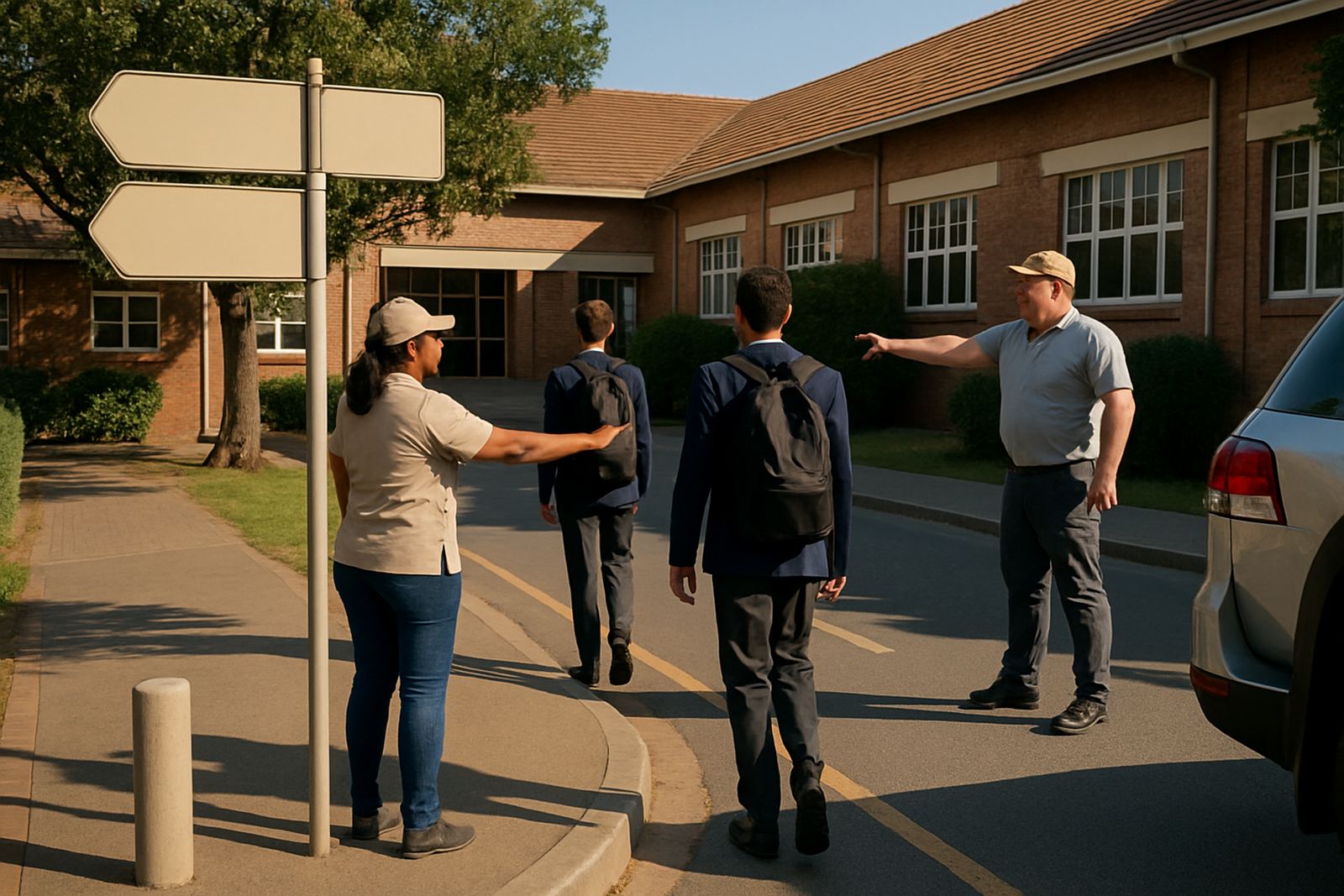
Once the boards were in place, the property team had a simpler way to manage each listing. The sale boards gave them a consistent face to the street, and the arrows reduced confusion for visitors trying to find the right driveway or open house entrance. In suburban areas like Alberton, where roads can be busy and turn-ins are easy to miss, a clear directional board saves time and avoids a lot of phone calls asking where to go. That was one of the main wins on this project.
They also had better visual continuity from one property to the next. Because the boards matched in size and layout, the campaign looked organised even when the addresses changed. That is important for property teams working across multiple suburbs, since a mixed bag of signs can look untidy very quickly. The result here was simple but useful: better visibility, quicker deployment, and less confusion on the ground. The team could order the next board knowing it would match the last one, which made planning easier. We also noticed the boards held up well through changing weather, with no early lifting at the edges and no obvious fading in the first campaign cycle.
What we would repeat on the next campaign
If we were doing this again for another Alberton listing run, we would keep the same basic approach. Reusable artwork, consistent board sizing and a mounting plan matched to each property all make the job easier to manage. For repeat suburban campaigns, the practical choice is usually the best one: clean layout, durable board material, and simple arrows that can be understood at a glance. That is exactly what this project needed, and it is still the way we would handle a similar brief for estate boards in Boksburg, Germiston or the wider Gauteng area.
For clients running recurring property campaigns, the real value is not only the printed board itself. It is the ability to order the next set without rethinking the whole setup, and to place each sign with confidence that it will read properly from the street. We have found that when the signage is planned properly from the start, the campaign moves faster and the team spends less time correcting avoidable problems. A small amount of setup work at the beginning saves a lot later, especially when multiple properties are coming online at once.
- Keep one standard layout across the campaign
- Use board sizes that suit both street visibility and handling
- Prepare arrows as separate pieces where practical
- Match fixings to the actual site conditions
Key facts
| Project type | Estate boards and directional arrows |
|---|---|
| Client location | Alberton, East Rand |
| Board material | 3 mm fluted PVC board |
| Main board size | 1 200 mm x 900 mm |
| Timeline | 2 weeks from artwork to installation |
| Use case | Repeated suburban property campaigns |