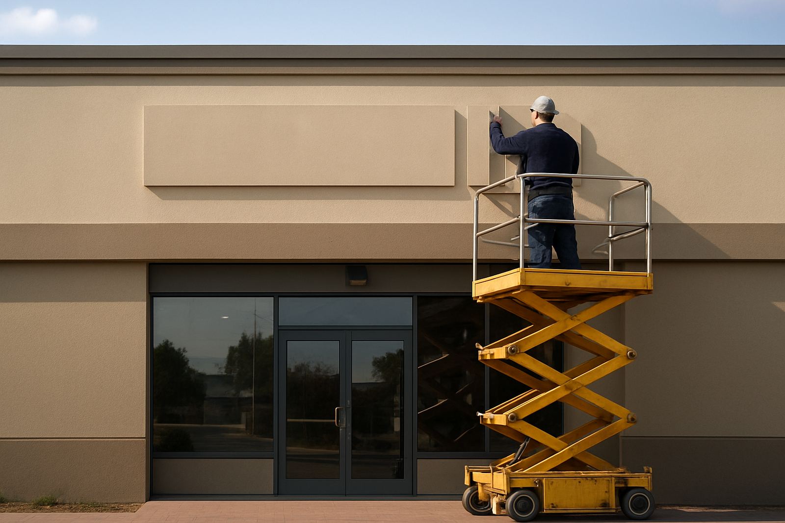
The brief for a busier stretch of road
The client was a motor trade showroom in Edenvale that wanted more presence from the road without changing the full frontage. The existing branding was getting lost in traffic flow, especially at peak times when drivers only had a few seconds to notice the building. The brief was simple enough on paper, but the site had a few realities to work around: limited fixing points, glass and cladding on the frontage, and the need for the sign to look clean during daylight and still stand out once the sun dropped.
We were asked to create a sign that would feel upmarket, but not fussy. The client wanted the name to carry more weight from a distance and to be legible for motorists approaching from both directions. In practical terms that meant larger letters, more depth, and positioning that gave the sign clear sightlines above the parked vehicles in front. The sign also had to suit a showroom setting where every detail gets noticed by customers walking in from the forecourt.
- Client type: roadside showroom
- Town: Edenvale, Gauteng
- Problem: low visibility from passing traffic
- Goal: stronger roadside reading distance
Site survey and measuring the frontage
We started with a site survey in Edenvale to check the mounting surface, the working height, and the viewing angles from the road. That early visit matters because a sign can look perfect on a drawing and still sit too low, too close to the roof line, or too tight against a colour band once it is on the wall. We measured the frontage in metres, checked the access for ladders and lifting gear, and looked at how the light changed across the face of the building through the day.
The site also needed a practical approach because a busy showroom can not shut down for long. We planned the work so the customer could keep trading with minimal interruption, and we made sure the installation did not block the entrance or customer parking more than necessary. With roadside work in Ekurhuleni, you also have to think about wind, dust and the extra wear that comes from open exposure. A sign needs to be fixed properly the first time, not adjusted again after a week.
- Measured the wall and set-out points on site
- Checked viewing height from approaching traffic
- Planned for limited disruption to trading
- Allowed for wind loading and outdoor exposure
Why elevated lettering was the right choice
For this project we recommended bold elevated lettering rather than a flat board treatment. Raised letters give more shadow and depth, which helps the name read better at speed and in changing light. That was important here because the showroom faces a road where drivers do not have long to take in the message. The 3D effect also suits a vehicle or showroom business, since it gives the frontage a cleaner, more finished look without overcomplicating the design.
The lettering was produced in durable signboard material with a clean painted finish for day-to-day visibility. The size was set to suit the wall proportions and the traffic distance, with enough depth to stand proud of the surface and create a clear profile. We also aligned the layout carefully so the line of text sat level across the facade, even though the building surface had small variations that would have been obvious if we had rushed the set-out. It is the kind of detail people do not always notice, but they feel it straight away when they see the finished frontage.
- Elevated lettering for stronger shadow and depth
- Sized for roadside reading at a distance
- Clean finish suitable for a showroom frontage
- Set out to stay level across the face of the building
Manufacture, finishing and quality checks
Back in the workshop, Johan and the production team prepared the lettering for manufacture, while Ayesha finalised the artwork setup and layout details. We kept the design direct and legible, with spacing that would not collapse visually when viewed from across the road. The finishes were checked under daylight conditions before dispatch so the colour and edges stayed consistent. In this part of Gauteng, a sign has to cope with strong sun, dust and occasional heavy rain, so the detailing has to be right from the start.
Before installation, we also checked the fixings and made sure each component was marked for position. That saves time on site and reduces the chance of small errors when the team is working at height. For a project like this, neat joints and accurate spacing are just as important as the material itself. A sign can be technically correct but still look off if the letter spacing is uneven or the mounting line drifts by a few millimetres. Those are the bits we keep a close eye on, always.
- Artwork setup and layout checked before production
- Letter spacing confirmed for clean roadside reading
- Finish checked in daylight before delivery
- Fixings marked for faster on-site placement
Installing the sign without holding up the showroom
Sibusiso led the installation team on site, with the work timed around the showroom’s trading flow. The sign was mounted securely and checked from several angles before we signed off the job. Because the frontage sits in a busy corridor, the placement needed to feel balanced from both close range and from oncoming traffic. We took care to keep the installation tidy, with no loose edges, visible mess, or unnecessary hardware showing on the face.
The fitment went ahead over a planned timeline of two weeks from final approval to completed installation. That included surveying, artwork setup, manufacture, transport and the on-site fitting. After installation, we walked the client through the finished sign and discussed simple maintenance. A raised sign like this does not need much day-to-day attention, but it does benefit from an occasional wipe-down and a check after severe weather or a dusty spell. In a place like Edenvale, that kind of practical care keeps the frontage looking sharp for longer.
- Project timeline: two weeks end to end
- Installed to suit active showroom trading
- Secure mounting with tidy visible finish
- Basic maintenance advice provided after handover
What changed after the new frontage went up
The main result was immediate visibility. The showroom name now carries better from the road, and the depth of the lettering gives it more presence against the building face. Drivers have a much clearer read on approach, and the frontage now matches the standard of the vehicles and service inside. That matters in motor retail because the sign is often the first thing a customer notices before they even slow down enough to decide whether to turn in.
For us, this was the sort of job we like in Ekurhuleni: straightforward in concept, but needing proper measuring, proper making, and proper installation to get it right. If we were doing it again, we would keep the same approach, namely a site survey first, a clean elevated letter design, and installation planned around trading hours. That combination works well for road-facing showrooms, especially where visibility and first impressions carry real weight.
- Better visibility from passing traffic
- Stronger frontage presence for the showroom
- Clean result that suits the site and the business
- Same approach would be used again for similar jobs
Key facts
| Project type | Edenvale showroom sign |
|---|---|
| Location | Edenvale, Gauteng |
| Sign style | Bold elevated lettering |
| Timeline | 2 weeks from approval to installation |
| Service scope | Site survey, manufacture and installation |
| Use case | Improved roadside visibility for passing traffic |