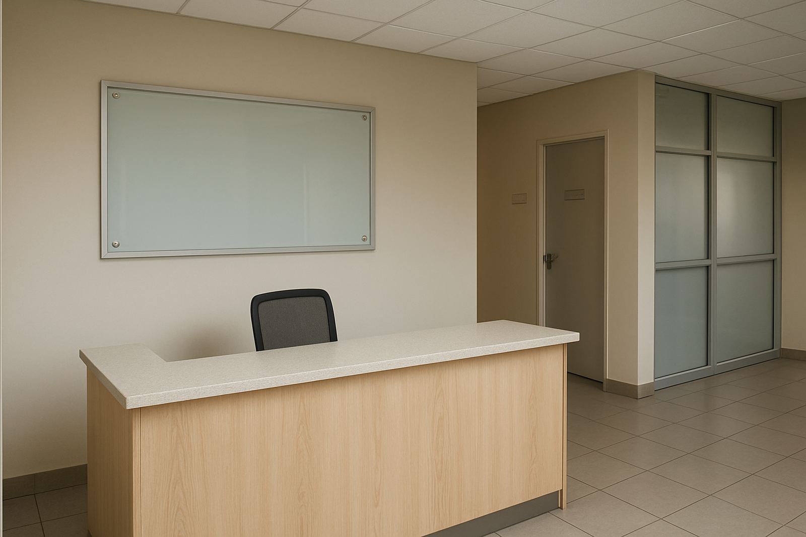
A neat office update for a busy Kempton Park team
The client was a professional office in Kempton Park that wanted to sharpen its public face without turning the premises into a construction site. They needed a cleaner reception area, better privacy on selected glass panels and room signs that made it easier for visitors to find their way around.
The brief was practical from the start. The office had standard internal glass, painted drywall and a reception counter that needed branding without blocking light. Because staff were still working on site, we planned the job in stages and kept the install work tight to normal office hours where possible. That made the space usable while the rebrand progressed.
- Location: Kempton Park, Ekurhuleni
- Project type: Office rebrand and internal wayfinding
- Primary finishes: printed vinyl, frosted vinyl, flat cut lettering and room name plates
What the brief asked for and what we had to work around
The main requirement was to improve the look of the reception and give the office a more organised feel. The client wanted the branding visible to visitors, but not overdone, and the glass areas needed a balance between privacy and daylight. We also had to work around existing signage fixings, door hardware and the usual office constraints, like limited access during meetings and load-shedding interruptions that can slow down equipment if a job is not planned properly.
We carried out a site survey first, measured the glass and wall spaces, and checked where each sign would be viewed from. That included reception sightlines, corridor traffic and door swing clearances. In offices like this, a sign can look fine on paper but still sit awkwardly if it clashes with a handle, a frame or a fire route. A few millimetres matter.
- Surveyed all visible sign positions before production
- Checked glass dimensions and fixing points on site
- Matched the layout to office traffic and visitor routes
Reception branding that feels part of the building
For the reception area, we produced branded vinyl graphics and a clean face-lit free finish across the counter frontage and main wall area, using the client’s artwork direction and making sure the scale suited the room. The aim was a tidy, professional welcome point that would read clearly from the entrance without making the space feel crowded.
We prepared the artwork in-house, adjusted spacing for the available wall widths and checked the lettering sizes against the viewing distance. On jobs like this, the small details are what keep the result consistent. Letter height, colour contrast and edge alignment all affect how polished the office feels once the sun comes in through the windows.
- Reception graphics sized for direct entrance visibility
- Materials selected for indoor office conditions and regular cleaning
- Installed with clean edges and aligned joins across the visible areas
Frosted vinyl for privacy without losing light
The frosted vinyl sections were fitted to selected glass panels where staff needed more privacy from passers-by and meeting room traffic. We used a cut and applied finish with clear margins where needed, so the office still had natural light and a light open-plan feel. This is a sensible choice for Kempton Park offices that want a cleaner look without darkening the room.
The vinyl was cut to suit each panel individually rather than using one generic pattern, which kept the finish neat around mullions and frame edges. We also took care around the lower glass sections so that the film sat evenly and did not catch on feet, bag handles or chair arms. It is a small thing, but in an active office it saves a lot of wear.
- Frosted vinyl applied to selected partitions and door panels
- Cut to individual glass sizes for a better fit
- Finished with neat edge trimming and final surface cleaning
Room identification signs that make daily movement simpler
The room identification signs were made to help staff and visitors move through the office without stopping to ask where to go. We supplied clear room names and function markers for doors and internal passages, using durable flat signs that are easy to read at a glance. In a working office, simple identification is often more useful than decorative signage.
We kept the size consistent across the set so the signs feel like one system instead of a mix of different styles. The result was a more ordered interior, with each room marked in a way that supports day-to-day use. That matters when clients arrive for meetings, couriers need directions, or new staff are still learning the layout. It also helps with compliance and general tidiness, which offices often underestimate.
- Uniform sizing across room and door signs
- High-contrast text for quick reading in corridors
- Mounted at practical eye level for staff and visitors
Timeline, installation and the final outcome
The full project ran over two weeks from survey to handover. Week one covered measurements, artwork setup and approval. Week two covered manufacture, preparation and installation. Because the office remained active during the work, we scheduled the fitment in a way that reduced disruption and kept noisy or dusty tasks to a minimum.
The result was a cleaner first impression at reception, better privacy on the glass and a clearer internal layout. The office looked more organised straight away, and the signs did their job without drawing too much attention to themselves. That is usually the right answer for this kind of project. It should look settled, not shout for attention.
- Project duration: 2 weeks from survey to completion
- Works completed with limited disruption to office operations
- Result: better reception impact, improved privacy and clearer room marking
What we would repeat on the next office rebrand
If we were doing this type of office rebrand again, we would follow the same approach: start with a proper site check, keep the artwork simple and test every panel against the actual room layout before cutting anything. That saves time and avoids rework. It also helps when the client needs the job turned around quickly, which is often the case in Gauteng offices.
For a similar Kempton Park project, we would again recommend a mix of frosted vinyl, crisp reception branding and clear room identification signs. It gives the office a professional feel without large structural changes or long shutdowns. That is the kind of update that works well in occupied spaces, especially where staff, clients and suppliers are moving through the building all day.
- Best practice: survey first, then confirm artwork against the real space
- Keep the sign system consistent across reception and internal doors
- Choose finishes that clean easily and hold up to everyday office use
Key facts
| Project location | Kempton Park, Ekurhuleni |
|---|---|
| Project duration | 2 weeks |
| Main components | Reception branding, frosted vinyl, room identification signs |
| Service work | Site survey, artwork setup, sign manufacture, sign installation |
| Finish type | Indoor printed vinyl and frosted privacy film |
| Use case | Occupied office rebrand with limited disruption |