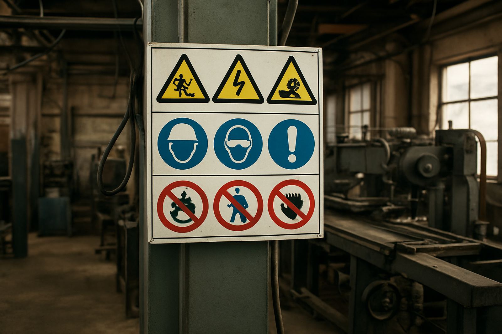
Start with the actual risk, not a generic sign
A safety sign should match the hazard that is really there on the floor, at the gate, or inside the workshop. Too many sites hang a few warning boards and call it done, yet the risks change from one area to the next. A loading bay needs different control from a spray room, and a retail back office needs a different message from a yard where trucks reverse all day.
The first step is a quick site survey. Walk the route where staff, visitors and contractors move. Note where people stop, turn, lift, climb, reverse or enter restricted areas. If a sign is not connected to a real action, it gets ignored very quickly.
- Mark hazards that can cause injury, fire, electric shock or chemical exposure
- Show mandatory actions such as helmet use, eye protection or authorised access only
- Use prohibition signs where a clear no entry or no smoking rule is needed
- Place emergency direction signs where people may need to exit fast during a power cut or fire alarm
Think about movement patterns before you choose placement
Good safety signs are read while people are moving, not when they have time to stand still and study them. In a busy Boksburg plant, a driver in a bakkie, a forklift operator and a pedestrian on foot all read signs at different speeds. That means placement matters as much as the message.
Put signs where the eye naturally lands. At eye level works for doors and corridors, but high mounted signs suit gate entrances, driveways and long sight lines across yards. If a sign is hidden behind stock, rubbish bins or a parked trailer, it is wasting money. In coastal humidity is not the issue in Boksburg, but dust, sun and vibration are, so fixings must stay tight and visible after months of daily use.
- Keep signs clear of doors that swing open or vehicles that park in front of them
- Repeat the same message at decision points, not only once at the entrance
- Use larger boards where people approach from a distance or at speed
- Check that night shift staff can still see signs under poor lighting or during load-shedding
Match size and wording to viewing distance
One of the most common mistakes is using a sign that is too small for the distance at which it must be read. A visitor walking through a reception area can read more detail than a truck driver turning into a yard. The further away the reader is, the bigger the lettering and symbols must be. Short, direct wording works best.
Keep the message simple. Safety signs are not posters. They are instructions. Use short verbs and standard wording where possible, because people need to understand the instruction at a glance. If there is too much text, the important point gets lost. Colour also matters, because most people recognise warning and instruction colours before they read the words.
- Large yards and gate entrances need bigger panels than internal doors
- Use bold symbols with high contrast for fast recognition
- Choose wording that can be understood by staff, contractors and visitors
- Avoid crowding one board with too many separate warnings
Choose materials that suit the site conditions
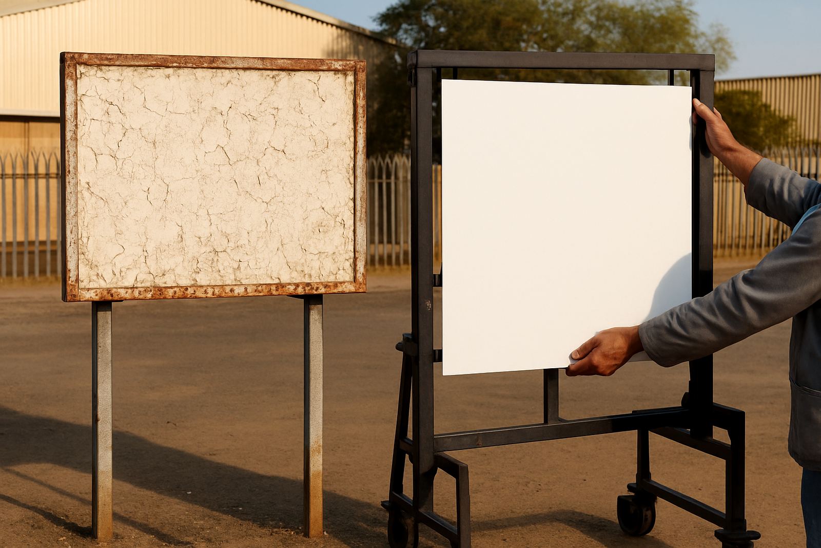
Not every sign material lasts the same way. A sign fitted inside a clean office is not under the same strain as one mounted on a palisade fence in the sun, or on a workshop wall where dust and vibration are constant. The right material helps the sign stay readable and in place for longer, which saves replacement costs.
For indoor areas, lighter boards can work well if they are protected from knocks. Outdoors, choose a harder-wearing finish and fixings that suit the surface. If the site is exposed to oil, water, dust or repeated cleaning, the sign face should be easy to wipe down. For temporary works or short-term control, removable signs may be more practical. On a Gauteng construction site or a short-term fit-out, the best sign is often the one that can be moved as the site changes.
- Use weather-resistant finishes for outdoor gates, fences and perimeter walls
- Ask for a material that can handle direct sun without fading too quickly
- Use secure mounting where wind, vibration or tampering is likely
- Plan for replacement where forklift traffic or machinery can damage boards
Use the right mix for factories, offices and mixed-use sites
Many businesses need more than one type of sign. A factory floor, a sales counter, a storeroom and a delivery yard all need different information. In one building, you may need hazard warnings, directional boards, emergency exit signs, name plates and vehicle markings. The trick is to build one clear system instead of placing odd signs wherever there is space.
For example, an industrial site in Boksburg may need entry control at the gate, PPE notices in the production area, fire point signs near extinguishers, and vehicle route markers where trucks reverse. A nearby office block in Germiston may need visitor direction signs, parking control, stair notices and room identification. The message should change with the risk, but the look and logic should stay consistent.
- Gate and perimeter signs for access control and visitor guidance
- Workshop and warehouse signs for hazard, PPE and traffic movement
- Office signs for emergency exits, room names and notice areas
- Vehicle and fleet marking for visibility on the road and on site
A local example from Boksburg yards and workshop floors
Think about a busy Ekurhuleni yard where deliveries arrive through the morning, staff enter on foot, and contractors move between the gate and the workshop. If the only sign is a small board by the entrance, people may miss the rules once the day gets busy. A better setup is to place a clear gate sign, a second notice at the pedestrian entrance, direction signs for vehicles, and warning signs close to the actual hazard points.
That approach saves time and reduces confusion. It also helps during power failures, when lighting drops and people rely more on colour, shape and placement. At sites across Boksburg, Benoni and Kempton Park, we often find that the most useful change is not adding more signs, but placing the right ones where people actually make decisions. That might mean moving a board closer to eye level, increasing the size, or removing a redundant notice that competes with the main warning.
When the layout changes, the signage should change with it. New plant, altered parking, a changed delivery route or a refurbished reception all need a fresh look at the signs on site. Leaving old instructions in place can be just as confusing as having no sign at all.