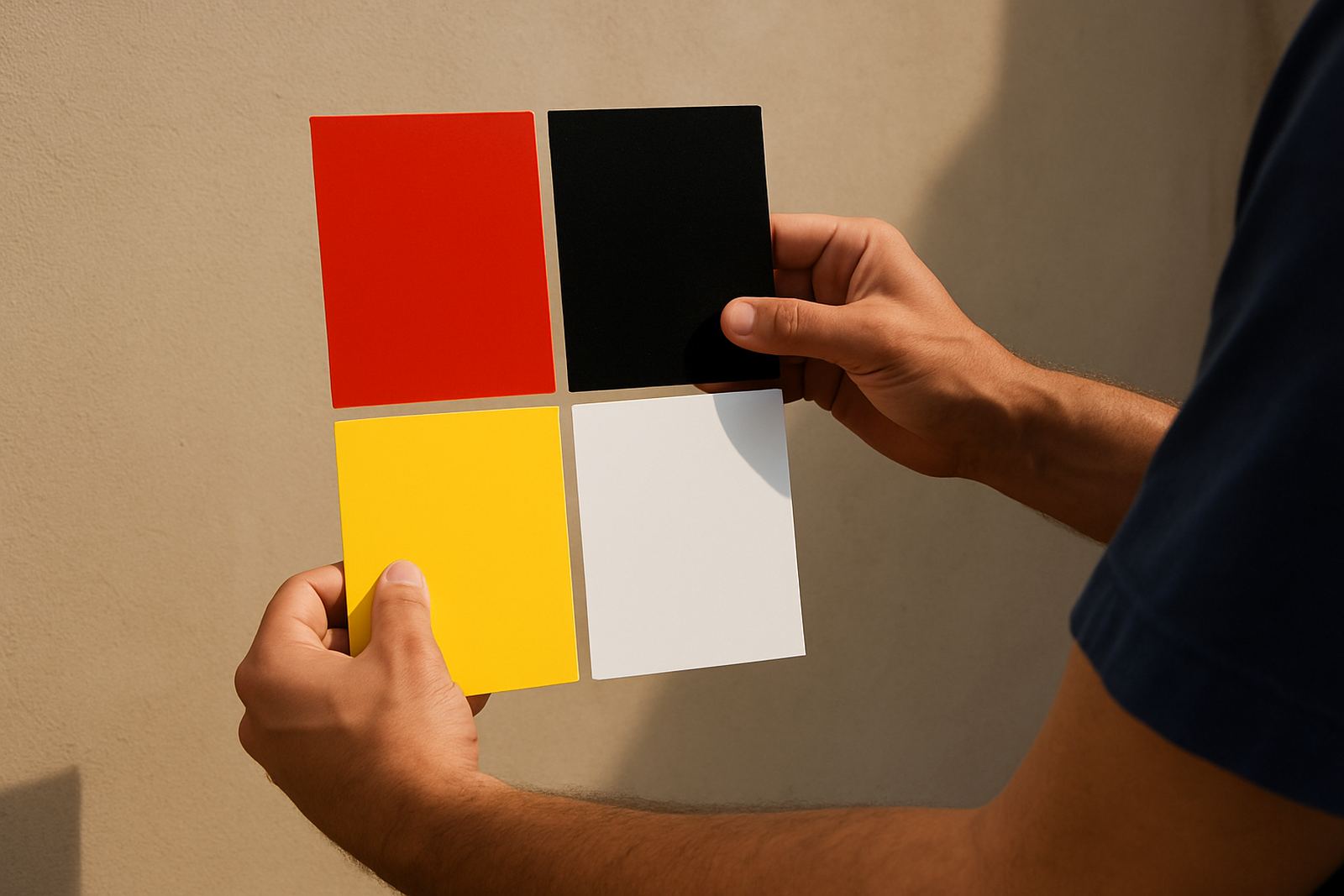
Why contrast does the heavy lifting on a sign
When people say a sign is easy to read, they are usually talking about contrast before anything else. The eye notices the difference between light and dark, not just the words themselves. That is why black on white works so well, and why pale lettering on a pale background often disappears, even if the text is large.
In practical terms, good contrast gives your sign a better chance of being seen in daylight, under street lights, and in the early morning when the sun sits low over the East Rand. It also helps drivers who only have a second or two to register a message. Extra wording can clutter a board, but clear contrast can make a short message far more effective.
For businesses in Boksburg, Benoni and Germiston, this matters on shopfronts, factory gates, delivery vehicles and estate-agent boards. A sign is there to do a job, not to force people to squint.
The colours that read well in local conditions
Colour choice is not just about taste. It is also about the place where the sign will live. In Gauteng, many signs face bright sun, dust, traffic movement and the odd patch of shade from trees or buildings. A colour that looks sharp in the workshop can wash out once it is mounted outside.
Some combinations usually give better results than others:
- Dark lettering on a light background for most general notices and name plates
- White or cream text on navy, charcoal or black for a strong formal look
- Yellow on black for warning and safety applications where quick recognition matters
- Red used carefully for alerts, pricing or short calls to action, not long paragraphs
It is also worth thinking about surface finish. Gloss can catch glare, especially on vehicle panels and aluminium boards. Matt finishes often hold up better in harsh light, and they can be easier to read from an angle.
Contrast beats clutter on boards and vehicle markings
Many signs carry too much information because people want to explain everything at once. The result is usually a crowded layout with small text and weak colour separation. A cleaner board with fewer words often works harder. If the message can be read in two seconds, it usually has a better chance of being remembered.
This is especially true for fleet marking and site boards. A delivery vehicle moving through Ekurhuleni does not need a paragraph on its doors. It needs a company name, contact point, service line and maybe one clear message. The same goes for a site board at a construction entrance near Springs or Kempton Park. If the wording is important, the colours must support it.
- Keep the most important line highest in contrast
- Use bold lettering before adding extra decoration
- Leave space around the text so the eye can settle
- Check the board from a distance, not only up close
That last point matters more than people think. A layout that looks fine on a drawing can fail once it is seen from 20 metres away or through a moving windscreen.
Safety signs need clear contrast first
Safety signs are not the place for soft colour choices or clever styling. They must communicate fast, and they must do it under less-than-perfect conditions. In workshops, yards and loading areas, you often deal with dust, shadow, poor light and machinery moving in and out. A warning sign that blends into the wall is no use at all.
For this reason, high-contrast colour pairing is usually the safest approach. Yellow and black, red and white, and blue and white are common because they stand out quickly and are understood at a glance. The actual wording should stay short and direct. If the sign has to be read while someone is walking, carrying or reversing a bakkie, the design must not make the job harder.
For businesses with multiple sites across Alberton, Edenvale and Midrand, keeping a consistent safety colour system also helps staff recognise signs faster. Once workers know what each colour means, they do not waste time figuring it out every time.
How print, vinyl and silkscreen affect the final result
Colour contrast starts at the design stage, but the production method can help or hurt the end result. Cut vinyl lettering gives very sharp edges and clean separation between colours, which is useful for naming entrances, vehicles and office panels. Printed boards work well when the artwork needs more detail, but the tones still need to be checked for legibility.
Silkscreen printing on clothing and corporate gifts also needs careful contrast. A logo that looks fine on paper may vanish on a dark shirt or overalls. That is why the garment colour should be considered before the artwork is approved. On ribbons and giveaway items, the available space is small, so the contrast has to do the talking. No one is going to stop and study tiny text just to work out what it says.
At Executive Screen Printers in Boksburg, the aim is to choose the right finish for the setting, whether that means a painted steel board, perspex panel, vinyl cut-out or a printed garment run. The best result is usually the one that reads cleanly, even when the light is not ideal.
A Boksburg example: a clearer board gets noticed sooner
Take a local industrial yard near Boksburg, where trucks enter through a busy gate and the security guard has only a few seconds to read each vehicle approach. The original board used pale grey text on a light blue background. In full sun it looked neat enough, but from the road it was hard to make out. After changing to dark navy lettering on a white field, the message became much easier to read from both directions.
The wording did not change. The service did not change. Only the contrast changed, and that made the sign more useful. That is the point many businesses miss. Better legibility often comes from making the same message easier to see, not from adding more lines.
If your board, vehicle marking or safety notice is not doing its job, it is worth checking the contrast before anything else. Sometimes a small adjustment in colour pairing saves the whole design.
- Test the sign in bright light and shade
- Look at it from the normal viewing distance
- Check it on the actual background, not only on screen
- Make sure the most important words stand out first
What to ask before you approve a sign layout
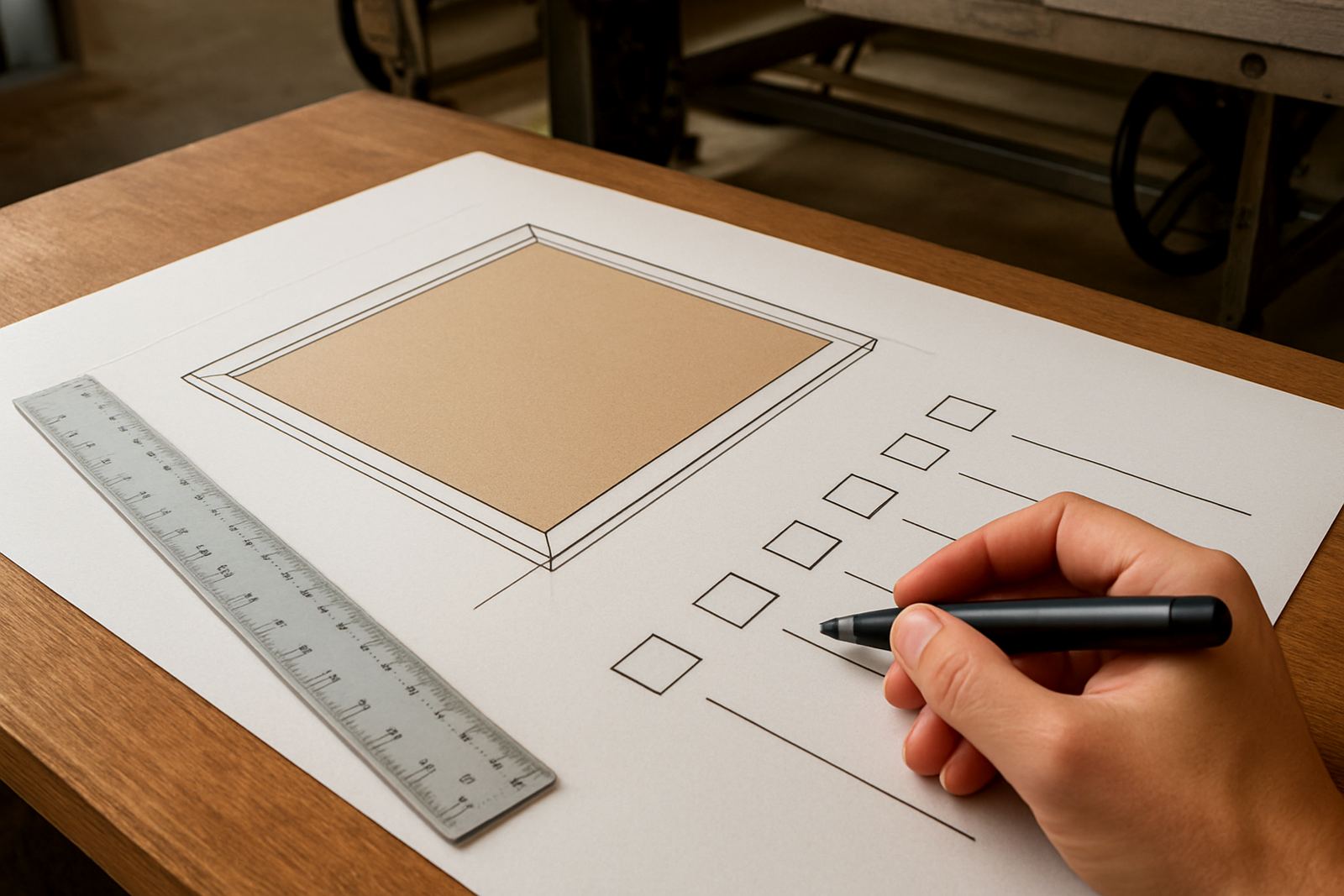
Before a sign goes into production, ask a few plain questions. Will it be read by pedestrians, drivers or both? Will it sit in direct sun, under a roof or beside a wall? Does the background colour make the text stronger or weaker? These questions often reveal problems early, before material is cut and time is spent on corrections.
If the sign is for coastal or dusty conditions, finish choice matters too. Dirt builds up on lighter surfaces, and some colours fade quicker than others in strong sun. Maintenance visits, refurbishment and vinyl removal can all help keep older signage usable, but a good colour combination from the start reduces the need for frequent fixes.
For businesses across Ekurhuleni and greater Gauteng, the practical rule is simple: if the message must be seen quickly, choose contrast first and decoration second. That approach usually gives cleaner results, fewer mistakes and better value for money.