Why Indoor Signs Need Different Thinking From Outdoor Boards
Indoor signs work in a very different way to street-facing boards. They sit closer to people, so the finish, size and wording matter just as much as the message. In an office in Boksburg or a warehouse in Jet Park, a sign is often read at walking pace, not from across the road, so it needs to be clear first and decorative second.
We often advise clients to think in terms of function. Does the sign identify a room, support a brand, warn staff, or guide visitors? A reception feature panel will be treated differently from a fire exit notice or a walkway marker. The right choice also depends on light levels, wall colour, cleaning routines and whether the area gets dust, moisture or frequent contact.
- Reception areas usually suit cleaner finishes and larger lettering
- Passages and stairwells need simple directional wording
- Workshops and stores need signs that can be cleaned and read fast
- Shared spaces should use consistent colours and sizes
Common Indoor Sign Types We Make For Local Businesses
There is no single solution for every interior. Some premises only need a few name plates and room markers, while others need a full wayfinding set across several floors or units. In a Germiston office park, for example, a client may want reception branding, door names, meeting room markers and staff-only notices all matched to one style. That keeps the place looking orderly, even when different departments use the space.
For factories and schools in Ekurhuleni, durability matters as much as appearance. Indoor signs should handle cleaning, occasional knocks and long hours under artificial light. We can make them in a range of materials and finishes depending on use and budget.
- Reception signs and logo panels
- Door names and room identification plates
- Directional signs and corridor markers
- Safety notices, machine warnings and restricted area signs
- Wall branding, motivational wording and department labels
Material Choices That Work In Offices, Shops And Workshops
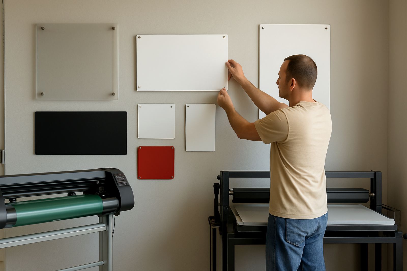
The best material depends on where the sign will live. In a modern office, a neat printed panel or cut vinyl lettering may be enough. In a busy workshop, a tougher board or a mounted plate may last better. If the area gets regular sun through glass, colour fade becomes an issue too, so it pays to plan ahead.
We look at the mounting surface, the traffic in the area and how often the wording may change. Some clients want signs that stay up for years. Others need panels that can be updated when staff move offices or a tenancy changes. It helps to choose a system that suits both the present and future use, not just the current layout.
- Foam board for light indoor use and temporary notices
- Acrylic for a clean office look and neat name panels
- Aluminium composite for harder wearing interior signs
- Vinyl lettering for walls, glass and doors
- Printed panels for branding, maps and multi-line notices
How Indoor Signs Help Visitors Find Their Way
A good indoor sign system saves time and prevents confusion. That matters in busy sites where people arrive for collections, interviews, deliveries or compliance checks. If visitors have to ask for directions every few metres, the front office gets interrupted and the place feels less organised. A proper layout also helps during peak times, load-shedding shifts or after hours access when staff are fewer.
For a Midrand client with shared offices and a small showroom, we would usually map the visitor route from the entrance to reception, then to meeting rooms, toilets and exit points. The signs should follow the same visual logic all the way through. That means the wording, arrows, size and placement must stay consistent, even if the building has odd corners or low ceilings.
- Use one wording style across the site
- Place signs where people naturally pause or turn
- Keep arrows and symbols large enough to read quickly
- Match room names to what staff actually call them
Branding Inside The Building Without Making It Feel Cluttered
Interior branding should support the space, not crowd it. A well-placed logo panel, a frosted glass strip or a set of cut vinyl words can change the feel of an entrance without filling every wall. In a polished showroom, less is usually more. In a call centre or training room, a few larger panels can help the space feel tidy and professional.
We often suggest that the sign style should match the use of the room. A boardroom can carry a cleaner, more refined look, while a production area might suit bold wording and simpler shapes. The trick is keeping the business identity visible while still letting the building function well. Too many mixed fonts, sizes and colours can make even a good sign programme look busy and unfinished.
For local businesses dealing with coastal humidity from time to time, or dusty workshop air on the East Rand, the finish also matters. Surfaces need to be easy to wipe down and less likely to stain or lift at the edges.
Practical Points Before You Order Indoor Signs
A short site survey can save a lot of trouble later. We check wall space, glass panels, ceiling height, lighting and the routes people actually use. That helps us work out the right size and fixing method. It also avoids placing a sign where a door swings into it or where glare makes it hard to read.
It helps to decide early whether you need permanent signs or a system that can be changed. In offices with staff movement, temporary lease changes or new compliance wording, removable or replaceable options can save money. If you are fitting out a branch in Benoni, Alberton or Springs, a clear plan upfront makes the install faster and keeps the site tidy while work is underway.
- Measure wall widths and viewing distances
- Check for glass, tiles, concrete or painted drywall
- Confirm wording before production starts
- Allow for future changes to departments or room names
- Ask about maintenance visits if the site changes often
A Boksburg Example: From Bare Passageways To Clear Direction
A small logistics office in Boksburg may start with a plain entrance, a few blank passage walls and one crowded reception area. The usual fix is not a single big sign, but a set of carefully chosen pieces: a reception logo panel, door names for staff offices, a direction marker to the loading bay, and safety notices near the store. Once those are in place, the whole site feels calmer and easier to use.
That is the value of good indoor signage. It does not need to shout. It just needs to guide people clearly and leave the business looking organised. Whether the space is a shop, a factory, a school or a corporate office, the right combination of materials and layout can make daily movement smoother and reduce confusion for both staff and visitors.
Executive Screen Printers has been making and installing signs in Boksburg since 1988, with work across Ekurhuleni and greater Gauteng. If you need indoor signs that suit your premises, the enquiry form on our contact page is the easiest way to start.