Why print position matters before colour or size
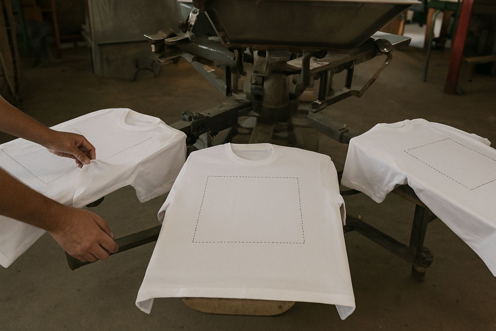
Most people start with the artwork, but placement should come first. A logo in the wrong spot can be hard to read under a safety vest, get hidden by an overall pocket, or look crowded on a small medium shirt. On the other hand, a well placed print gives the garment purpose and keeps the brand looking tidy across the full order.
In Boksburg and the wider East Rand, we often print for warehouse teams, local contractors, event crews and school fundraisers. Each group wears shirts differently. A foreman standing on a plant site needs the logo visible from a few metres away, while a hospitality team may need a cleaner chest mark that sits neatly with a name badge. That is where placement decisions start paying off.
- Chest placement suits name identity and everyday wear
- Sleeve placement works well for smaller marks and support messages
- Back placement gives the biggest read distance for teams and events
- Print size should match garment size, not just the artwork file
Left chest is the most common choice for corporate clothing because it feels orderly and professional. It places the logo where people naturally look during a greeting or handshake, and it leaves space for a company name, position title or a small slogan. For overalls, golf shirts and work shirts, this option is practical because it does not interfere with pockets or zips too much.
A standard left chest print usually sits about 80 to 100 mm wide for adult shirts, though the exact size should suit the garment cut. For ladies fits and smaller sizes, the artwork may need to come down a bit so it does not look cramped. If the print is too large, it can move too close to the armpit or sit awkwardly above a pocket, which is something we check at the artwork stage.
- Best for staff uniforms, admin wear and branded giveaways
- Works well with embroidered style layouts too, if the artwork is simple
- Good choice when the shirt already carries other items like badges or reflective tape
- Ideal for smaller logos that need a tidy, understated finish
Back printing is the strongest option when visibility matters most. It gives you the biggest area for a company name, contact detail, service line or event message. If your team is working on a roadside site in Germiston or moving between bays in a Boksburg depot, the back print gives quick recognition from a distance. It is also useful on promotion shirts where the front is kept clean for a more modern look.
For vehicle crews, security teams and event marshals, a back print can carry the name and role in one clear line. In a busy setting, that saves time because the public does not need to ask who someone is. We usually place the main wording across the shoulder blades or mid-back depending on the shirt size and whether there is a hood, seam or reflective strip in the way.
- Best for high visibility branding and team identification
- Useful for service numbers, web addresses and event names
- Can be combined with a smaller chest mark for a balanced layout
- Needs enough open space on the garment to avoid folding or bunching
Sleeve placement is often overlooked, yet it is useful when you want extra branding without crowding the front or back. It suits smaller logos, division names, website lines or safety messages. On short sleeve shirts, the print can sit on the upper arm and still be seen when someone is holding tools, signing papers or pointing directions. On long sleeves, there is even more room for a stretch of wording, though the cuff area must be left clear.
This spot works well for layered branding. For example, a company can keep the front logo small and add the branch name on the sleeve. That helps when a team covers more than one area, such as Boksburg, Benoni and Kempton Park. It also gives a useful option for clothing that already has a large back print and needs a second mark without looking overdone.
- Good for branch names, department labels and short slogans
- Useful on long sleeves where more text is needed
- Helps keep the front and back uncluttered
- Best when the garment fabric is smooth and not too stretchy
Not every shirt takes print in the same way. A cotton promotional tee behaves differently from a polycotton work shirt or a heavy-duty safety garment. Stretch, texture and seams all affect where the print should go. A collar, chest pocket, reflective tape or front zip can shift the usable area and make a normal layout look off centre.
Before production, we check the garment type and the final use. A cotton event shirt may suit a bold back print, while a work shirt with pockets may need a smaller chest mark and sleeve detail instead. On darker shirts, placement also matters because the print needs to stand out against the cloth and still keep its shape after washing. This is where good planning saves costly reprints.
- Cotton tees allow more flexibility for larger artwork
- Work shirts often need careful positioning around pockets and seams
- Polyester blends need print methods suited to the fabric and washing routine
- High-use clothing should be placed where folding and wear are least likely
Placement is not only about looks. It affects comfort too. A heavy print placed badly can feel stiff under the arm or across the shoulder blades. If a garment is worn in hot weather around Gauteng, the wearer will notice that right away. The same applies after repeated washing. A print that sits on a seam or stretches over a curved panel may crack sooner than one placed on a flatter area.
For businesses ordering staff shirts, it helps to think about the job first. Are the shirts for daily wear, occasional events, or both? Will they go through industrial washing, or just a normal home wash? Will the team wear them under overalls, rain gear or hi-vis clothing? These answers help determine whether the print should be small and durable, or large and eye-catching. Sometimes the best answer is a mix, with a chest print for identity and a back print for visibility.
Take a contractor in Boksburg working on a housing project near Benoni and Springs. The crew needs shirts that are easy to spot, but also neat enough for client meetings. A left chest logo gives the formal touch. A larger back print carries the company name and main contact line for quick identification on site. Then a short sleeve mark can show the division name so the team knows which crew is on which task.
That combination gives practical value all day long. The client sees a professional front view at the office or site entrance, while the public sees clear branding from the back when the team is moving around the property. It is a simple layout, but it works because each print has a reason for being there, not just a random bit of decoration.