
Start with the viewing distance, not the signboard
When a sign is being planned for a street-facing shop, the first question should be simple: how far away must it be read? A person walking past a retail strip in Boksburg may be only 5 to 10 metres away, while traffic on a main road could be 20 to 40 metres away. That difference changes everything, from letter height to how much detail you can safely include.
A common mistake is trying to say too much on one board. If the message has to be read from a moving vehicle, keep it short and direct. For example, use the business name, the main service and one clear contact point or trading line. A board with too much copy becomes a blur, even if it looks neat up close.
- Use larger lettering for main roads and smaller lettering only where people stop or walk slowly.
- Keep the key message in the upper half of the sign where it is easier to notice.
- Plan for the highest viewing angle if the sign sits above a doorway or in a canopy area.
- Leave enough open space around the text so the sign does not look crowded.
Use contrast that stays clear in Gauteng light
Strong contrast is one of the cheapest ways to improve visibility. Light text on a dark background, or dark text on a light background, will always read better than similar tones used together. This matters in Gauteng, where bright sun, heat shimmer and reflections from glass can make weak colour choices disappear fast.
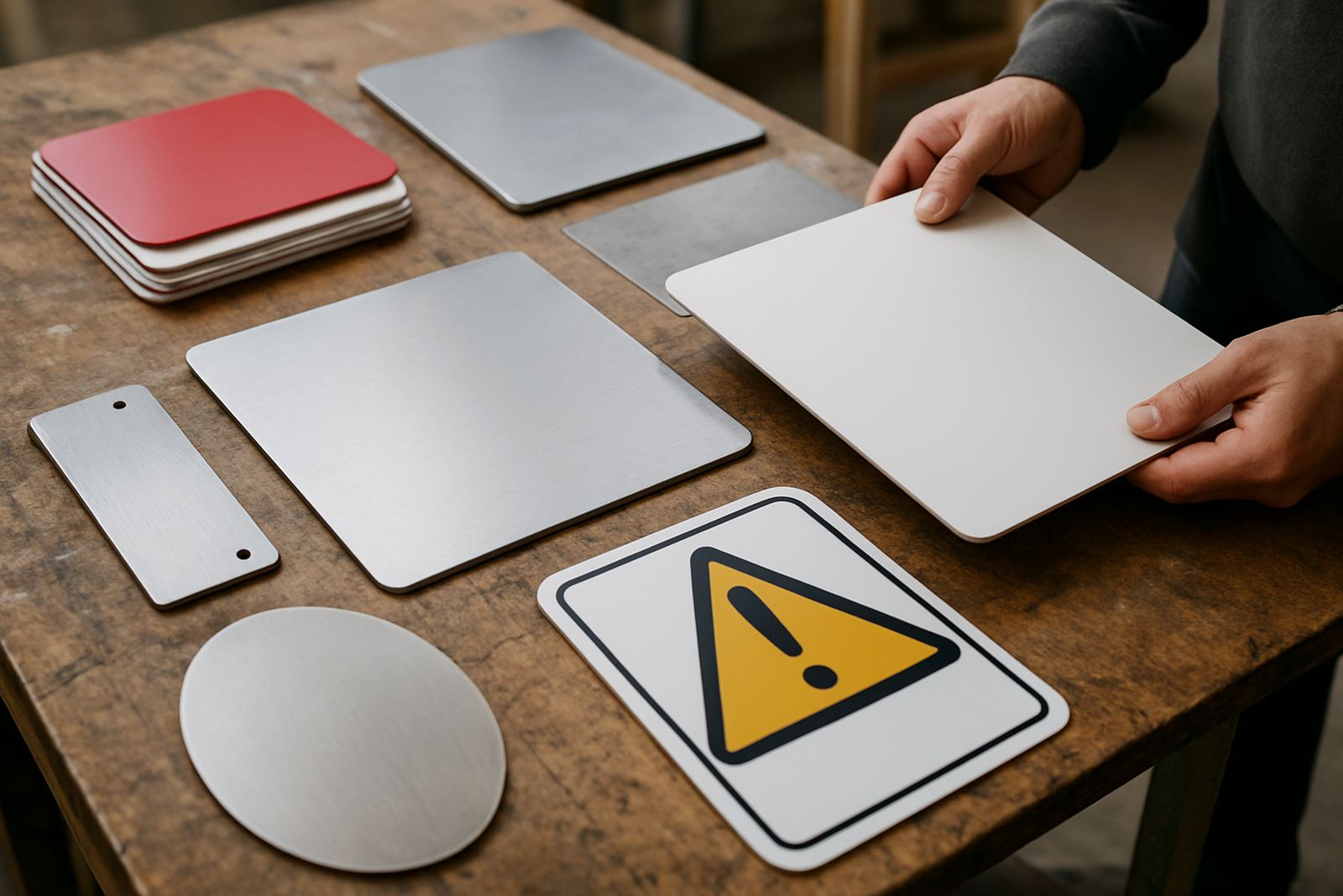
We also see problems with glossy finishes on shopfronts facing east or west. At certain times of day, the glare can wash out the message. A matt or satin finish often works better for visibility, especially on aluminium composite panels, painted boards and cut vinyl lettering on glass. It is a small decision, but it can save a lot of frustration later.
- Choose one main colour for the background and one for the text if possible.
- Avoid pale lettering on a pale wall, even if it looks elegant on paper.
- Test the colours in daylight, shade and evening light before production.
- If the frontage is busy, use a border to hold the sign visually together.
Place the sign where customers actually look
Good placement is about eye level and sight lines. Many businesses in industrial and mixed-use areas have fascia boards mounted too high, or hidden behind awnings, trees or parked vehicles. A sign can be well made and still fail if the passing eye never reaches it.
In practice, the best location is often the one that faces the dominant traffic flow and sits close to the point where people decide to turn in. If customers enter from a side street, a second sign near the driveway may work better than making the main board larger. Estate agents, workshops and small retail units often benefit from a simple combination of fascia signage, window lettering and a street-side board. The message is then visible before the visitor reaches the entrance, which helps a great deal.
- Check for poles, tree branches, gates and security bars that block the view.
- Use corner positions if your frontage can be seen from two directions.
- Keep critical information near the entrance, not only on the main road side.
- Allow for pedestrians, not just drivers, especially in built-up shopping areas.
Make the text work hard, not the design
Shopfront signs do not need to be complicated to be effective. The text must be readable in a second or two, and that means choosing a clear type style, keeping spacing open, and avoiding overly thin lines. If the letters are too decorative, they lose strength from a distance. If they are too cramped, they become difficult to read in poor light or from the wrong angle.
For many East Rand businesses, a practical layout is best: business name, service type, and one extra line such as trading hours or a short directional note. If the sign is for a service business rather than a retail store, the wording should make it plain what is offered. A driver should not have to guess. That kind of clarity is more valuable than fancy effects, and it usually lasts longer too.
A strong shopfront message often includes:
- The business name in the largest text
- The main service or product line below it
- A simple directional line such as entrance this side or deliveries at the rear
- Any legally required notices placed neatly, not squeezed in at the edge
Think about day, night and load-shedding
Visibility does not stop at sunset. If the area is active after dark, or if the shop trades early and late, the sign should still be readable when the light drops. External flood lighting can help, but it must be aimed properly. Too much light creates glare, while too little leaves the board useless. In areas that experience load-shedding, it is wise to assume the sign may need to stand on its own without powered lighting for part of the day.
Reflective materials can be useful for safety signs, yard notices and some directional boards, but they should be used carefully on a shopfront. A reflective finish can work against the design if it creates shine at the wrong angle. We often suggest testing the sign position at different times, especially on properties with security fencing, shaded entrances or narrow road access. That quick check can prevent a costly do-over later.
- Consider whether the sign must work in full sun, dusk and after hours.
- Use lighting that does not cast the board into shadow from the canopy above.
- Check how the sign looks with vehicle headlights on it at night.
- Where power supply is uncertain, avoid relying only on lighted features.
Keep the sign clean, fixed and up to date
A sign that was once clear can lose impact through dust, faded print, peeling vinyl or loose fixings. In Boksburg and across Gauteng, wind, traffic grime and summer rain all take a toll. Coastal humidity is not the issue here, but dust, soot and sun exposure are enough to dull a frontage over time. A faded sign sends the wrong message about the business behind it.
Regular maintenance is usually simpler than replacement. A scheduled check can pick up loose brackets, lifted corners, damaged letters or outdated information before customers notice. For businesses with fleet vehicles, site boards or multiple branches, matching the shopfront to the rest of the signage helps the whole operation look organised. It also makes it easier for visitors to identify the correct entrance or collection point.
Useful maintenance habits include:
- Wipe down the sign face and check the fixings every few months
- Remove old stickers, temporary notices and damaged vinyl promptly
- Replace faded printed panels before the message becomes hard to read
- Review the wording after trading hours, services or access points change
A local example from an East Rand frontage
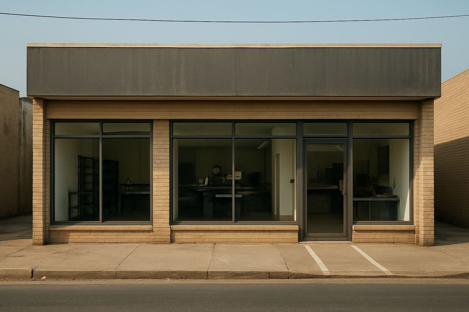
Consider a small service business in Boksburg with a road-facing frontage, a side gate for deliveries, and a busy street with fast-moving traffic. A tiny panel above the door would not do much on its own. A better setup would be a clear fascia board with the business name, a window graphic showing the main service, and a smaller direction board at the driveway entrance. If the lettering is bold, the colours contrast well and the placement follows the traffic flow, the business becomes easier to find without shouting for attention.
That same principle works in Benoni, Germiston, Kempton Park, Alberton, Springs, Edenvale and Midrand too. The details may change, but the basics stay the same: size, contrast and placement. When those three are handled properly, the sign does its job quietly and the shopfront starts pulling its weight every day.
For businesses that need site surveys, artwork setup, sign manufacture, vehicle fitment or installation across Ekurhuleni and greater Gauteng, the process is usually straightforward when the frontage is measured properly from the start. It saves time, avoids guesswork and gives the customer a clearer first look at the business.