
Start with one clear point of focus
If a reception wall has too many elements, the message gets muddy. A simple company name in cut lettering, a logo panel or a neatly mounted sign board can do most of the work if it is sized correctly for the wall and seen from the entry point. In Boksburg offices we often find that a clean single feature works better than trying to pack in slogans, services and too many colours.
For smaller spaces, keep the main feature centred and leave breathing room around it. For larger foyers, a wider treatment can help balance the wall, especially where there is a long counter or a high ceiling. The aim is not to fill every inch, it is to make the area feel ordered and easy to read.
Choose materials that suit the building and the traffic
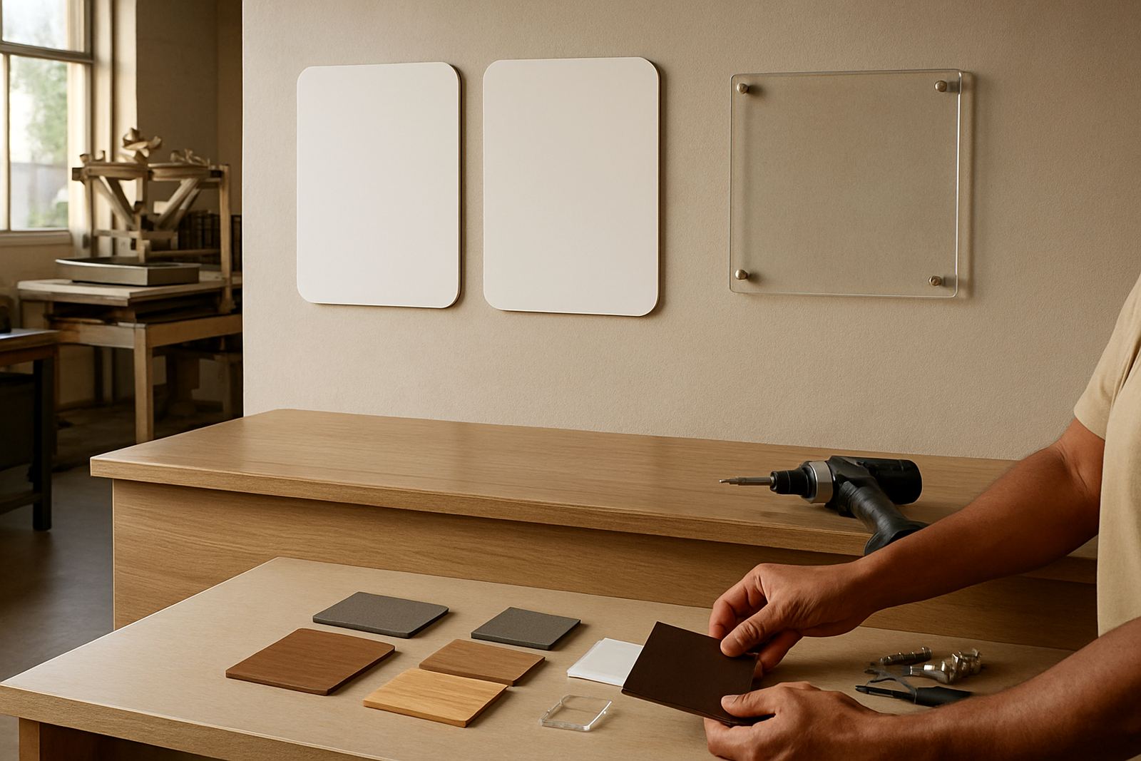
Reception signage should cope with daily use, dust from open doors, cleaning products and sunlight from glass fronts. In Gauteng offices, faded graphics and peeling vinyl show quickly if the wrong material is used. A good mix is often a rigid backing panel with cut vinyl, or stand-off lettering for a sharper look. In humid coastal installs the fixings matter even more, but in the East Rand the bigger issue is usually dust and sun.
- Cut vinyl works well for names, short taglines and clean lettering.
- Mounted panels suit corporate branding, maps or layered graphics.
- Raised lettering gives depth without making the wall feel busy.
- Printed panels are useful when you need a full colour image or detailed pattern.
Ask for a material that suits the wall surface too. Painted drywall, brick, glass and board all need different fixing methods, and a rushed installation can leave gaps or damaged paint.
Use layering when the brand needs more presence
Some receptions need more than a single logo. This is where layering helps. A backing panel can create contrast, then the company name or emblem can sit proud of the surface. A second layer may carry a line such as a service description or branch name. Done well, it feels considered rather than busy.
Layering also helps with older buildings where the wall is uneven or the paint finish is not ideal. It can hide imperfections and give the area a more finished look without major building work. For larger corporate spaces in Midrand or Germiston, a layered wall can also help set the tone for visitors before they even sign in.
- Keep colour contrast strong enough to read from the doorway.
- Match the finish to the brand, matte for formal offices, gloss for more lively spaces.
- Do not overload the wall with too many fonts or messages.
- Allow enough space for lighting and cleaning access.
Think about lighting, glare and after-hours viewing
A reception sign can look sharp in daylight and then disappear at night if the lighting is poor. Overhead downlights sometimes create glare on gloss panels, while a dark corner can flatten even a good sign. Before installation, it helps to stand where a visitor will stand and check what they actually see at eye level.
In offices with glass fronts, direct sun can make certain finishes hard to read. A matte surface or a slightly textured panel often performs better than a highly reflective one. If the reception is visible from outside after hours, a well lit wall sign can also help the business look active and organised, even when the shutters are down.
Local example: a Boksburg reception with limited wall space
A small transport office in Boksburg had a narrow reception with one wall beside the counter and a glass partition on the other side. Rather than crowding it with posters, the team used a compact logo panel above the sign-in point, cut lettering for the company name and a slim service strip underneath. The result was tidy and easy to read from the doorway.
Because the office had hardwearing floors and a lot of foot traffic, the finish had to be practical as well as neat. The panel was mounted clear of the wall so it could be cleaned, and the lettering was kept simple so it would not date quickly. That sort of choice works well for businesses in Boksburg, Benoni or Kempton Park where the reception area often doubles as a waiting space and a working entrance.
Keep the wall easy to maintain, not just nice for day one
Reception branding should still look good after six months of fingerprints, dust and regular cleaning. That means planning for maintenance from the start. Avoid tiny pieces that are hard to wipe around, and do not place important wording where chair backs, queue rails or security gates will scrape it.
A practical reception wall should also allow for updates. If staff names, divisions or accreditations change often, keep those details separate from the main logo feature so the core branding stays in place. A quick refresher every few years, maybe a colour update or a new panel, is usually better than replacing the whole wall.
- Choose fixings that can be checked and tightened if needed.
- Leave access for cleaning behind counters and around corners.
- Keep changeable information on smaller add-on panels.
- Plan a maintenance visit if the wall gets heavy daily traffic.
The strongest reception branding is usually the simplest
When a reception wall is well planned, people notice it without having to study it. That is the goal. A neat logo, clean lettering and the right scale can tell visitors they are in the right place and that the business pays attention to detail. More is not always better, and in many offices the calmest option gives the strongest impression.
For businesses across Ekurhuleni and greater Gauteng, the right approach depends on the wall size, the lighting and how the reception is used each day. A simple setup can work well for a small professional office, while a layered finish may suit a larger front area or a brand that needs more presence. Get the basics right and the reception starts doing quiet work for the business from the moment someone walks in.