
Start With How People Enter, Turn and Park
Before you decide on size or colour, watch how people arrive. Do they walk in from a pavement, turn off a main road, or enter through a boom gate and parking area? A sign should meet the eye where the decision is made, not after the visitor has already missed the entrance and gone past the gate.
For shops, offices and factories, the best place is often the first clear line of sight from the road or driveway. If a customer has to stop, reverse or ask security for directions, your sign has already failed its main job. Positioning should guide a driver early enough to slow down safely and still read the message without strain.
On larger premises, it often helps to split the message. Put the main company sign at the road frontage, then use smaller directional signs near the parking area, reception entrance and loading bays. That way people get one clear message at each decision point instead of one crowded board trying to do everything.
Use Sight Lines, Not Just Empty Wall Space
Empty wall space can be misleading. A sign may fit neatly on a wall but still be blocked by a tree, roller door, roof overhang, pole or parked vehicle. The practical approach is to stand where the reader will stand and check the angle at which the sign is seen. If the face is too high, too low or turned away, the message loses impact.
For roadside signs, the main rule is simple: place the wording where a driver can read it without taking eyes off the road for too long. In a busy area like Boksburg near industrial routes or around Benoni and Germiston, traffic often moves quickly enough that a sign needs to be bold, direct and positioned early in the approach.
Good sight lines also matter indoors. Reception names, safety notices and department signs should be placed at natural eye level and in the path of travel. If visitors must search for directions, the layout is doing too much work for the sign. In practice, that means placing information where feet already go, not where the wall happens to be open.
Match the Fixing Position to the Surface and Weather
Where a sign goes is linked to how it is fixed. Masonry, steel, cladding, palisade fencing and timber all need different mounting methods. A panel that sits well on a solid wall may vibrate on a fence or loosen on a lightly framed structure. Correct fixings reduce rattling, cracking and water entry around the edges.
In Gauteng, wind gusts and summer storms can place real strain on large boards, especially on corner sites and tall masts. Near the coast, humidity and salt air make corrosion a bigger issue, but even inland signs need sensible sealing and enough support. A sign that is placed high but not properly anchored becomes a maintenance problem very quickly.
- Check wall strength before choosing the size and weight of the sign
- Allow enough clearance for gates, shutters and roller doors
- Keep fixings accessible for future maintenance visits
- Avoid placing boards where standing water can sit against the bottom edge
- Leave space for lighting, brackets or future changes to the message
For long-term use, placement should also allow easy cleaning and inspection. If a sign can only be reached with a cherry picker every time a screw loosens, the upkeep cost rises fast.
Place Safety Signs Where Risk Actually Starts
Safety signs work best when they appear before the hazard, not after it. A warning at the point of danger is useful, but an earlier sign gives people time to slow down and act. In workshops, warehouses and yards, that means placing signs at entries, near moving vehicles, around chemicals and at points where visitors need to change behaviour.
Think about the order of movement. A person should see the instruction before they step into the danger zone. For example, a helmet sign belongs at the entrance to the hard hat area, not only beside the machine. Fire point signs need to be visible from the route people would use in an emergency, with no boxes or shelves blocking them.
Where there are multiple hazards, do not crowd one wall with every notice. Separate signs by purpose and keep them at the correct height. People notice what is clear and repeated in the right place. A cluttered board often gets ignored, while a well placed sign is read without delay.
Fleet Marking and Vehicle Signs Need the Right Viewing Angle
Vehicle signage is only effective when it can be read from the side, from behind and at a distance in traffic. On bakkies, panel vans and delivery vehicles, the doors, tailgate and side panels all offer different viewing opportunities. The wording should sit where pedestrians, customers and other drivers see it during normal movement.
For business fleets moving around Boksburg, Kempton Park, Midrand and the wider East Rand, side visibility matters just as much as rear visibility. A vehicle parked at a site, in a loading bay or at a traffic light should still carry the message clearly. The best placement avoids handles, seams, wheel arches and fuel caps that interrupt the lettering.
- Use the flatter body panels for the main wording
- Keep contact details large enough to read in traffic
- Avoid placing important text across door gaps
- Check visibility with sliding doors open and closed
- Think about how the vehicle is parked at customer sites
Fleet marking should also allow for daily use. If a van is loaded and unloaded often, the sign should not sit in a spot where straps, tools or cargo rub against it.
A Local Example From an Industrial Site in Boksburg
On one Boksburg industrial site, the biggest mistake was not the sign itself, it was the position. The company had mounted a board high on a side wall facing away from the entrance road. Drivers coming from the gate saw the loading bay first and only noticed the company name after they had already stopped to ask. Visitors kept circling the yard, and the team lost time giving directions.
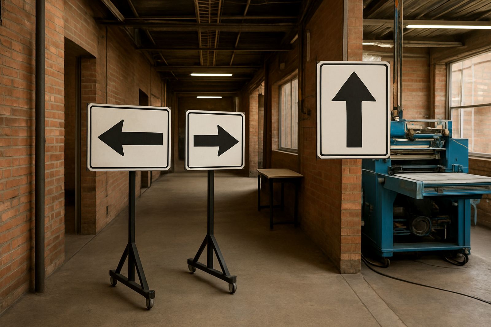
The fix was straightforward. The main identification sign was moved to the front approach where vehicles slowed down, while smaller directional signs were added near the turning point, the reception door and the dispatch area. The new layout followed the actual movement pattern on site, so the first sign answered, the second one confirmed, and the third one guided the visitor to the right door.
That kind of placement work saves time every day. It also makes the property feel ordered, which matters to suppliers, clients and inspectors. In practical terms, the right position does more than advertise a name. It reduces confusion and helps the whole site run smoother.
Test the Placement Before You Commit
A good sign location should be checked in real conditions. Look at it in daylight, at dusk and from the usual traffic direction. If the site gets strong sun, shadows can change the way the wording reads at different times of day. If the area has security gates or delivery trucks, make sure the view is not blocked when the site is busy.
It is also worth testing the distance. Stand at the point where a driver first sees the sign and ask whether the main message is readable in a few seconds. If not, the wording may need to be larger or the board may need to move closer to the approach. Small changes in height or angle can make a big difference.
When placement is planned properly, the sign works with the site instead of against it. That is the aim for every project, whether it is a shopfront in Boksburg, a factory yard in Springs, or a business park in Midrand.