Why a good sign can still fail on site
A wayfinding sign is not judged by how neat it looks on the workshop floor, it is judged by whether people find the right door, bay, gate or office on the first try. In busy places around Boksburg, Benoni, Germiston and Kempton Park, visitors are often watching traffic, looking for parking and trying to read signs while driving slowly. If the message is not immediate, they miss it.
One of the most common errors is assuming a sign will do all the work on its own. A board can be perfectly made, with clean vinyl and good colour contrast, but still fail if it is placed after the decision point. By then the driver or pedestrian has already turned, stopped, or parked in the wrong place. That means more calls to reception, more repeated directions, and more people wandering around the yard or building block.
At Executive Screen Printers in Boksburg, we often see this on industrial sites, office parks and retail yards where signs were added one by one over time. The result is a patchwork that looks tidy enough but does not guide flow. The fix is usually not more signs, it is better planning.
Arrow direction is not a design detail, it is the instruction
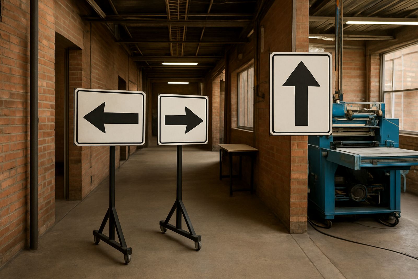
Arrows are small, but they carry the whole message. A wrong arrow can send a truck down the wrong lane, or direct a visitor to a side entrance that is locked after hours. In load-shedding conditions, when site lighting is weaker, people rely even more on what the sign says and where it points. That is why arrow direction needs to match actual movement on site, not just a rough sketch.
Another mistake is using too many arrows on one board. When every line points somewhere different, the sign becomes cluttered and the eye slows down. A clean layout with one clear action is far better than trying to explain the whole property at once.
- Place arrows where the decision is made, not after the turn.
- Keep wording short: reception, loading bay, security, exit.
- Check the view from a moving vehicle, not only from a standing person.
- Make sure arrows still make sense in both daylight and poor light.
We often remind clients that an arrow only works if the person reading it has enough time to react. On a narrow driveway or a gate entry, even a strong sign can be too late if it is placed 10 metres after the choice point.
Late placement is the mistake that costs the most time
Late placement happens when site signs are installed after the problem has already started. For example, a new warehouse opens in the East Rand and the entrance is clearly marked, but there is no direction from the main road, no advance notice in the parking area and no sign at the split between deliveries and visitors. The first week then turns into a stream of lost drivers and repeated questions.
The best time to think about wayfinding is during the site layout stage, not after operations begin. This allows for proper sequence: first approach, then turn, then park, then enter. A good system gives people a trail to follow, and that trail should start earlier than most owners expect. On larger sites in Midrand or Alberton, that may mean several signs from the boundary to the final door.
Late placement also creates security problems. Visitors may drive into staff parking, contractors may stop at the wrong boom gate, and delivery vehicles may block access while trying to reverse out. That is why we look at the full route during site surveys, not only the wall where the sign will finally hang.
Materials, visibility and the local weather matter
Wayfinding is not only about text and arrows. A sign that fades, warps or reflects badly will lose its value quickly. Around Gauteng, dust, sun exposure and summer rain can affect visibility, while in coastal humidity areas the wrong fixings may start rusting sooner than expected. On exposed sites, reflective or high-contrast finishes can help, especially where vehicles enter early morning or after dark.
Size is just as important as material. A small sign in a large yard can be neat but useless. A board that is too high may also miss the driver’s eye line. The right solution depends on distance, viewing speed and mounting height. We often use cut vinyl lettering, printed boards or mixed signage depending on where the sign is being read from.
- Use strong contrast between background and text.
- Choose materials suited to sun, rain and dust.
- Match sign size to the reading distance.
- Allow for cleaning and maintenance, especially on outdoor boards.
For sites with regular deliveries, maintenance visits are worth planning ahead. A faded arrow or a loose board can undo a lot of good work, and a quick repair is usually cheaper than repeated confusion.
Real example from an East Rand site
A practical example comes from a mixed-use site in Boksburg where visitors were missing the front office and going straight to the loading area. The signs were attractive, but they were installed too close to the building entrance and the arrows pointed as if people had already reached the correct zone. The problem was not the workmanship, it was the sequence.
After reviewing the movement pattern, the route was simplified. Directional boards were added at the outer gate, the internal split, and the final parking point. The wording was reduced to the essentials, and each board was mounted at a height that drivers could read without stopping dead in the lane. Staff stopped giving long verbal directions, and the site felt calmer within days.
This is the sort of practical job that matters on a working property. Whether it is an estate-agent board, a factory entrance, a church hall or a contractor yard, wayfinding must follow how people actually move through the space. If it doesn't, the sign is decoration, not direction.
How to avoid the usual mistakes before you order signs
A sensible wayfinding plan starts with questions, not artwork. Where do people first arrive? Which gate is for visitors? Where do trucks turn? Which door must not be used after hours? Once those answers are clear, the sign list becomes much easier to get right. It also reduces waste, because you are not paying for boards that never help anyone.
Before manufacture, check the route from a driver's seat and on foot. Look for blind corners, confusing junctions, gate controls, and any point where a visitor might slow down and second-guess the turn. That is where the sign belongs. If a site has several buildings or shared parking, the route should be broken into stages so each sign answers one simple question.
- Map the route from the road to the final destination.
- Place signs before each decision point.
- Use plain wording that suits staff, visitors and contractors.
- Check if the sign can be seen in daylight, shade and at night.
- Review the system after the first few weeks and adjust where needed.
At Executive Screen Printers, we handle site surveys, artwork setup, manufacture, installation and maintenance so the finished result works in the real world. For businesses across Ekurhuleni and greater Gauteng, that practical approach saves time, avoids repeat confusion and keeps the site moving in the right direction.