Start With the Job the Garment Must Do
Before artwork gets placed on a shirt, overall or jacket, decide how the garment will be used. A warehouse hand needs a print that stays readable from a few metres away, while a technician on site may need smaller marks that do not interfere with harnesses, pockets or reflective trim. In Boksburg and the rest of Ekurhuleni, many teams move between the workshop, yard and client premises in one shift, so comfort matters just as much as appearance.
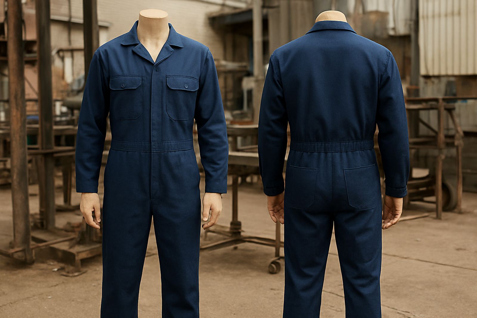
We normally look at the garment first, then the print area. A logo that works on a golf shirt may feel far too heavy on a lightweight T-shirt. On overalls, placement must avoid seams, zip lines and high-wear zones where frequent washing and movement can crack or wear down the print faster.
- Check the fabric weight before choosing print size
- Leave room for pockets, reflective bands and stitched panels
- Keep key wording where it can be read at arm’s length
- Allow for wash shrinkage on cotton-rich garments
Keep the Logo Size Honest and Readable
A logo should be big enough to be seen, but not so large that it crowds the garment. For chest prints, a clean mark around 80 mm to 100 mm wide often suits everyday wear. Back prints can go bigger if the message is meant for site visibility, delivery crews or event staff. Sleeve marks are useful for small contact details, job titles or safety reminders, though they need careful sizing so the arm still bends freely.
Small lettering is where many businesses run into trouble. Fine text can disappear after a few washes or become hard to read in bright sun. That matters in places like Kempton Park or Springs where teams work outdoors and people need to identify staff quickly. If the message is important, give it enough space and choose a weight that stays clear on the fabric.
- Use bolder lettering for job titles and contact details
- Do not place tiny text over seams or textured fabric
- Match the print size to how far away it must be read
- Test the design on the actual garment colour, not only on screen
Match the Print Method to the Fabric and Use
Different garments need different print methods. A simple one-colour mark may suit a cotton T-shirt or polycotton overall, while multi-colour branding may need a more detailed setup. The key is to choose a method that will hold up through washing, drying and daily wear. In Gauteng, where many firms use workwear across multiple shifts, durability saves money over the long term.
For corporate gifts and event wear, a lighter print can be enough because the item is handled less often. For site clothing, fleet uniforms and service teams, the print must last through dust, sun, sweat and repeated laundering. If the garment is used near machinery, also think about heat exposure and how the print will feel on the body. A heavy patch on the wrong spot can be uncomfortable by mid-morning.
- Choose the method according to fabric type and use
- Keep heavy ink coverage away from flex points
- For dark garments, make sure the artwork has enough contrast
- For light garments, avoid colours that fade into the cloth
Use Branding Rules That Stay Consistent Across the Team
Consistency is what makes a business look organised. One shirt with a small logo, another with a huge one and a third with different wording sends mixed signals. It is better to set a simple standard for size, position and colour, then use it across T-shirts, overalls, ribbons and other branded items. That way, clients recognise your staff at a glance, whether they are in Boksburg, Alberton or Midrand.
We often advise clients to keep one main logo format for the chest and one larger format for the back. Add name tabs or role titles only where they help with customer service or site control. If too much information is packed onto the garment, the message becomes cluttered and the print loses impact. Clean branding is usually easier to manage and cheaper to repeat over time.
For businesses with multiple branches or crews, it helps to keep a short brand guide. It does not need to be a big document, just a clear note on logo size, colours, placement and approved wording. That makes reorders much faster and reduces avoidable errors.
Think About Comfort, Movement and Weather
Workwear is worn in heat, wind, dust and sometimes rain, so branding must not make the garment less usable. Large solid prints can trap heat on the chest or back, especially on dark shirts. In summer around the East Rand, that extra heat becomes noticeable by lunchtime. In cooler months, layered clothing changes how the print sits, so the artwork should still look tidy over long sleeves or under a jacket.
Fit also matters. If a print sits too close to an underarm seam or across a stretch zone, it can crack sooner. A good layout respects how the wearer moves. That is especially useful for installation crews, delivery staff and workshop teams who lift, reach and bend all day.
A Boksburg Example: Printing for Site and Shop Teams
Consider a Boksburg contractor with a small office, a workshop and two vehicles on the road each day. The staff need shirts that identify the company clearly at client sites, but they also need garments that remain comfortable in the workshop. A chest logo, a readable back line and a small sleeve mark may be enough. There is no need to overfill the shirt with copy that will never be read from a distance.
Now add fleet marking and a site board. The same brand should carry through the vehicles, the signage at the premises and the workwear on the team. When the logo proportions, wording and colours stay consistent, the business appears orderly and easier to trust. That consistency is useful in local markets where clients compare suppliers quickly and often make decisions on first impressions.
Good branding is not about making everything bigger. It is about placing the right message in the right size, on the right surface, so it does its job day after day.